When two businesses offer similar services, buyers don’t choose based on “who has the nicest logo.” They choose based on trust, which is why incorporating website trust signals is crucial for businesses looking to stand out.
Trust is built through a stack of signals—small visual and content cues that reduce uncertainty and make the decision feel safer. In 2026, this matters more than ever because prospects are comparing multiple options quickly, often on mobile, and often without talking to anyone first.
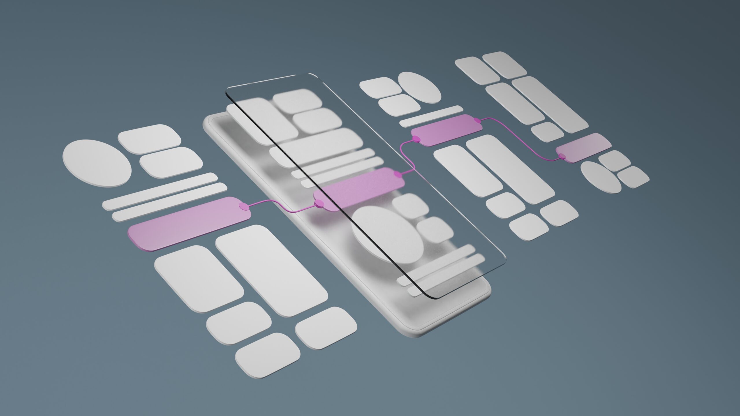
Below is a practical breakdown of the trust stack—the signals that help people choose you faster.
What “trust signals” really do
Trust signals reduce three buyer fears:
-
“Are they legitimate?”
-
“Will they deliver?”
-
“Will working with them be painful?”
Your website should answer these without making visitors work for the information.
Layer 1: First-impression trust (visual credibility)
These are the signals people process instantly.
1) Clean layout + readable typography
Cluttered pages, inconsistent spacing, or hard-to-read text can feel unprofessional—even if your service is excellent.
Best practice: Prioritize hierarchy, whitespace, and scannability.
2) Consistent branding across pages
Inconsistency looks like inexperience or lack of attention to detail.
Best practice: Use a consistent color palette, typography, button style, and image direction across the site.
3) Mobile-first experience
If the mobile experience is frustrating, trust drops immediately.
Best practice: Make contact actions easy, use readable font sizes, and keep pages fast.
Layer 2: Proof trust (evidence you can deliver)
This is where trust becomes concrete.
4) Testimonials that include outcomes
A testimonial like “Great service!” is nice. A testimonial with a result is persuasive.
Better testimonial formats:
-
“They redesigned our site and inquiries increased within weeks.”
-
“The new brand system helped our team stay consistent across campaigns.”
5) Case studies and before/after examples
Even short “mini case studies” are powerful:
-
problem
-
approach
-
outcome
Visual before/after comparisons help prospects understand value quickly.
6) Credible third-party signals
These include:
-
BBB accreditation
-
industry memberships
-
awards
-
certifications (only the most relevant)
-
notable clients (when appropriate)
Important: Place these near CTAs and service pages—not buried.
Layer 3: Clarity trust (reducing confusion and uncertainty)
People trust what they understand.
7) Clear service pages that answer buyer questions
Service pages should include:
-
who it’s for
-
what’s included
-
process steps
-
timelines (ranges are fine)
-
FAQs
-
next step CTA
When people can’t tell what’s included, they assume risk.
8) Transparent next steps
If your process is unclear, prospects hesitate.
Best practice: Show a simple 3-step path:
-
Discovery call
-
Proposal / scope confirmation
-
Delivery timeline + milestones
9) Clear contact options
Make it obvious how to reach you:
-
call / email / booking
-
response expectations (even a simple “Replies within 1 business day” helps)
-
short form (reduce friction)
Layer 4: Safety trust (signals that lower perceived risk)
These elements make buyers feel protected.
10) Professional policies and basics
Depending on your business, include:
-
privacy policy
-
terms of use
-
refund/cancellation policy (if applicable)
-
secure forms + SSL (site must show “secure”)
11) Real business information
Prospects feel safer when they see:
-
service area
-
business address (or region)
-
operating hours
-
professional email domain
-
consistent name across platforms
12) Freshness and maintenance signals
Outdated sites feel abandoned.
Quick improvements:
-
current year in the footer
-
updated portfolio/work examples
-
recent posts or updates
-
remove old promotions and broken links
Where to place trust signals (this matters)
Trust signals are most effective:
-
above the fold (light touch)
-
on service pages
-
near the primary CTA
-
on the contact/booking page
-
in page sections where buyers hesitate (pricing/process)
If your proof is only on your About page, many visitors will never see it.
Quick Trust Stack checklist (5 minutes)
Ask yourself:
-
Can a visitor understand what we do in 5 seconds?
-
Do they see proof without scrolling forever?
-
Is the mobile experience friction-free?
-
Are next steps clear and low-risk?
-
Does the site look current and cared for?
If you answer “no” to two or more, improving trust signals is one of the fastest ways to improve conversions.
Final thought
Design builds the first layer of trust. Proof and clarity close the gap.
When your website consistently communicates legitimacy, capability, and clear next steps, prospects feel safer choosing you—without needing a long sales conversation.
If you want help strengthening your trust stack, myVisualConcept can run a UX + credibility audit and provide a prioritized list of improvements.


“As a small business, having a design partner we can rely on is invaluable. myVisualConcept handles all our creative needs — from social media graphics to seasonal promotions — with consistency, professionalism, and a deep understanding of our brand.”