
In today’s digital age, mobile devices have become the primary means through which users access the internet. This shift towards mobile-first browsing underscores the critical importance of responsive UX Design.
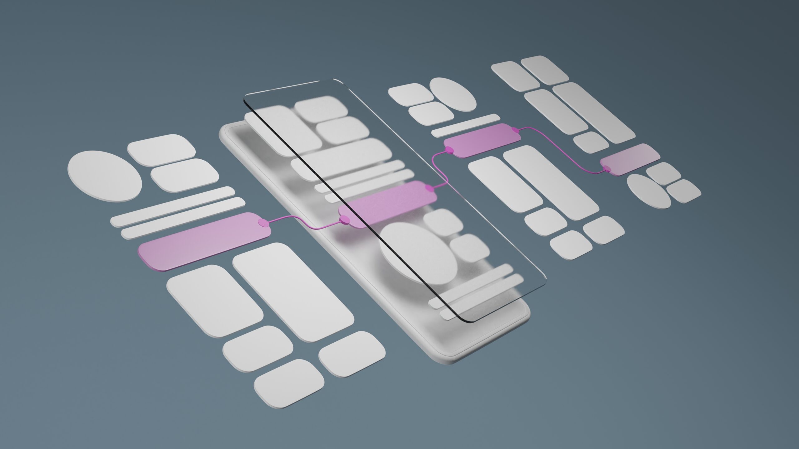
Responsive design ensures that websites are mobile-friendly, adapting their layout and functionality to provide an optimal viewing experience across a wide range of devices, from desktop monitors to smartphones. This blog post delves into the principles of responsive design and its pivotal role in creating websites that excel in a mobile-first world.
Understanding Responsive Design
Responsive design is a web development approach aimed at crafting sites to provide an optimal viewing experience—easy reading and navigation with a minimum of resizing, panning, and scrolling—across a wide range of devices. At its core, responsive design involves the use of flexible layouts, images, and cascading style sheet (CSS) media queries.
The Principles of Responsive Design
- Fluid Grids: Rather than using fixed-width layouts, responsive design uses fluid grid layouts that scale dynamically to fit the content and screen size.
- Flexible Images: Images in responsive design are created to be fluid within the boundaries of the grid, ensuring they scale correctly on any device.
- Media Queries: CSS media queries allow designers to apply different styles based on the device’s characteristics, such as its width, height, orientation, and resolution.
The Critical Role of Responsive Design
Enhancing User Experience
A responsive website provides a seamless experience to users, regardless of the device they are using. This adaptability is crucial in ensuring that all users have a positive interaction with your website, thus reducing bounce rates and improving conversion rates.
Boosting SEO Rankings
Search engines like Google prioritize mobile-friendly websites in their search results. Implementing responsive design is essential for SEO because it improves site usability, speeds up page load times, and reduces duplicate content, which can negatively impact your rankings.
Increasing Reach to Mobile Audiences
With the increasing prevalence of smartphones and tablets, a mobile-friendly website is essential to reach a wider audience. Responsive design ensures that users on mobile devices can access and navigate your site as easily as those on desktops, broadening your potential customer base.
Future-Proofing Your Website
As new devices with varying screen sizes continue to enter the market, responsive design helps ensure that your website will look and function correctly, no matter the device. This approach to UX Design is inherently future-proof, saving you time and resources in the long run.
Best Practices for Implementing Responsive Design
- Start with Mobile: Adopt a mobile-first approach by designing for smaller screens first and then scaling up for larger screens.
- Prioritize Content: Determine what content is most crucial for your users and ensure it’s easily accessible across all devices.
- Test on Real Devices: While simulators and emulators are useful, testing your responsive design on actual devices will give you the best insight into the user experience.
- Optimize Performance: Ensure that your website loads quickly on mobile devices by optimizing images, leveraging browser caching, and minimizing code.
The dominance of mobile internet usage has made responsive design not just a nice-to-have feature but a necessity.
By adhering to the principles of responsive design, businesses and web developers can create websites that are not only visually appealing but also functional and accessible across all devices. In a mobile-first world, responsive design is key to engaging a wider audience, enhancing user experience, and securing higher SEO rankings. Embrace responsive design to make your website truly mobile-friendly and ready for the future.


“As a small business, having a design partner we can rely on is invaluable. myVisualConcept handles all our creative needs — from social media graphics to seasonal promotions — with consistency, professionalism, and a deep understanding of our brand.”