Brand consistency isn’t about being “perfect.” It’s about being recognizable.
When branding is inconsistent across your website, social media, proposals, and marketing materials, people notice—even if they can’t explain why. The result is subtle but real: reduced trust, weaker recall, and fewer conversions.
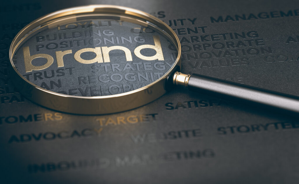
This quick audit helps you spot the most common inconsistencies and fix them with simple, practical changes.
Why brand consistency matters (especially in 2026)
In a crowded market, buyers use visual cues to decide:
-
Is this business credible?
-
Are they established?
-
Will they be reliable to work with?
Consistency signals professionalism. Inconsistency signals chaos—often unfairly, but that’s how perception works.
The 10-point brand consistency audit
1) Your logo appears in multiple versions
Different lockups, different colors, stretched shapes, outdated marks—this happens fast.
Fix: Choose 1–2 approved logo versions (primary + simplified) and retire the rest.
2) Your colors shift from platform to platform
Your website looks one way, social posts another, and printed materials don’t match either.
Fix: Define a core palette (primary + secondary + neutral) and document exact HEX/RGB/CMYK values.
3) Your typography isn’t consistent
You may have five different fonts across your marketing materials or inconsistent font sizing.
Fix: Standardize 2 font families max (headline + body) and set basic rules for hierarchy.
4) Your imagery style changes dramatically
Some visuals are clean and modern, others feel stock-heavy, and some are low-quality or mismatched.
Fix: Pick a consistent direction: photography style, lighting, filters, illustration style, icon set rules.
5) Your tone of voice changes by channel
Your website sounds formal, LinkedIn sounds casual, and emails sound inconsistent.
Fix: Create a short “brand voice” guide with 5 adjectives (e.g., clear, confident, approachable, professional, direct) and examples of do/don’t language.
6) Your call-to-action wording varies too much
“Contact us,” “Get started,” “Book now,” “Request pricing,” “Learn more”—all in different places.
Fix: Choose 1 primary CTA and 1 secondary CTA and use them consistently across channels.
7) Your layouts don’t follow a system
Margins, spacing, alignment, and placement feel random depending on who created the asset.
Fix: Build a simple layout system: grid rules, spacing scale, and template structure for common assets.
8) Your social graphics aren’t recognizable without your logo
If your logo is removed, can someone still tell it’s your brand?
Fix: Use consistent brand cues—color blocks, typography style, border treatments, icon style, and repeated composition patterns.
9) Your marketing collateral doesn’t match your website
Brochures, capability statements, proposals, and PDFs look like a different brand than your online presence.
Fix: Create a “core kit” of templates: one-pager, proposal cover + section pages, presentation layout, letterhead, and social post system.
10) Your brand files aren’t organized or accessible
Teams frequently use the wrong version because it’s the easiest one to find.
Fix: Create one shared folder with “Approved” assets only (logos, fonts, templates, color palette, image library).
What to do if you scored 4+ inconsistencies
You don’t necessarily need a full rebrand. Often, what you need is a brand system refresh:
-
updated logo usage rules
-
standardized colors and typography
-
templates for common assets
-
consistent image and icon direction
-
quick “do/don’t” guidelines
That’s what creates consistency without starting from scratch.
Final thought
Your brand doesn’t need to be louder—it needs to be clearer and more consistent. When your visuals and messaging align across platforms, trust increases and marketing becomes easier to execute.
If you want, we can run a full brand consistency audit and deliver a prioritized fix list plus updated templates so your team can stay consistent moving forward.


“As a small business, having a design partner we can rely on is invaluable. myVisualConcept handles all our creative needs — from social media graphics to seasonal promotions — with consistency, professionalism, and a deep understanding of our brand.”