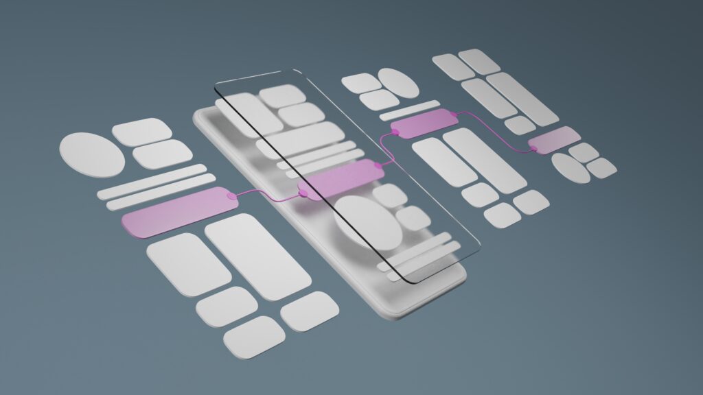
Service websites often struggle for the same reasons: unclear navigation, weak messaging hierarchy, and friction that makes it harder to contact the business.
The good news? You don’t need a full rebuild to see results. In many cases, a handful of UX improvements can noticeably increase clarity, trust, and lead flow.
Below are seven high-impact upgrades we frequently recommend—written in a “before/after” format so you can spot them quickly on your own site.
1) Before: Vague homepage headline
Before: “Welcome” / “We deliver quality service”
After: A headline that clearly states what you do + who it’s for + outcome
Example:
“Professional HVAC Repair in Katy, TX — Fast Service, Clear Pricing, Reliable Results”
Why it works: Visitors instantly understand what you offer and whether it’s for them.
2) Before: Too many competing calls-to-action
Before: “Contact,” “Get Quote,” “Learn More,” “Schedule,” “Call Now” all at once
After: One primary CTA across the site, plus one secondary option
Why it works: Less decision fatigue → more action.
3) Before: Services page is a list
Before: A bullet list of services with no structure
After: Service categories + short descriptions + who it’s for + next step
Bonus: Add “Most requested services” at the top.
Why it works: Buyers don’t just want options—they want clarity.
4) Before: Contact info is hard to find
Before: Contact page only, buried in the menu
After: Contact options in the header + footer + CTA blocks on service pages
Best practice: Make it easy to call, email, or book—especially on mobile.
Why it works: You remove friction at decision points.
5) Before: Proof is hidden on an About page
Before: Testimonials are buried or missing
After: Proof near CTAs—short, outcome-based testimonials on key pages
Examples of proof:
-
quick testimonial snippets
-
certifications and badges (where relevant)
-
case studies or before/after examples
-
“trusted by” client list (if applicable)
Why it works: Trust is built where decisions happen.
6) Before: Pages are hard to scan
Before: Long paragraphs and inconsistent headings
After: Strong headings, short sections, bullets, and consistent spacing
Why it works: Most users scan first, read second.
7) Before: Mobile experience is an afterthought
Before: Small text, hard-to-tap buttons, slow pages
After: Mobile-first layout with readable type, clear spacing, and fast loading
Quick checks:
-
buttons are large enough to tap
-
forms are easy to complete
-
primary CTA is visible quickly
-
pages load fast on cellular data
Why it works: Many service businesses get the majority of traffic on mobile.
A quick self-audit (5 minutes)
Open your site on your phone and ask:
-
Can I tell what you do in 5 seconds?
-
Is the next step obvious?
-
Can I find services fast?
-
Do I see proof without digging?
-
Can I contact you in one tap?
If the answer is “no” to two or more, these UX improvements will help.
Final thought
Good UX isn’t complicated—it’s clear, intentional, and friction-free. The best service websites are built to support real buyer behavior: scanning, comparing, and taking action quickly.
If you’d like, myVisualConcept can run a UX and conversion audit and deliver a prioritized fix list you can implement without rebuilding your entire site.


“As a small business, having a design partner we can rely on is invaluable. myVisualConcept handles all our creative needs — from social media graphics to seasonal promotions — with consistency, professionalism, and a deep understanding of our brand.”